Project: Brighte mobile on-boarding
The problem
Brighte approached me at a late stage of their design process. The team had already developed several screens without a writer or content strategist.
So late, in fact, that launch was merely a few weeks away.
The business required users to sign up for loans through the app.
The requirements:
Create momentum so users finish the process quickly (sign-ups being the key business metric)
Fit the company's tone of friendly, yet professional (we're dealing with finance, after all)
Prevent users from feeling overwhelmed
Hint at a sense of progress


THE PROCESS
Without a style guide, I had to make decisions quickly.
I quickly analyzed user personas to understand who the language should target. The overwhelming audience was "mom and pop" home owners who want to upgrade with some solar panels.
Exploration
I explored a few different possibilities for language while also considering competitor apps. Most were quite detail heavy. I opted to stay away from that approach, given the user base.
Defining the problem
The key problem here was ensuring that we could keep users moving through the app quickly and successfully without burdening them too much with information.


The synthesis + SOLUTION
To tackle these problems, I chose a few solutions:
I opted for a more informal tone (using contractions, for instance)
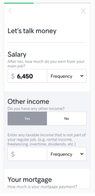
I created a sense of inclusion and hand-holding by using the word "let's" at the start of each screen
If users didn't meet criteria, I wanted them to come back in order to fulfill the key business metric - so said as much directly
I also wanted to let them down gently with a softer tone, so avoided negative language like "you didn't meet the criteria"
I opted for a more serious tone when dealing with privacy or terms and conditions, so as to achieve the "friendly, yet professional" requirement

Friendly, yet professional


THE results
As this was a freelance project, the business has not been able to share key sign-up metrics.
However, product manager and brand teams agreed the copy hit the mark, and was implemented in the project for launch.